ONLINE COLLABORATION & PARTICIPATION
HOME


Our next task was to test out other people’s visualisations, so each group moved to another groups work. We had to understand how the data is being presented and what room we think it may represent – this is based on our interpretations. We were asked to add on our own data to the visualisation, based on our understanding of how it works – whether it be the correct way or not. Finally when everyone was done we all gathered around to discuss each person’s work to give opinions and feedback to one another.
As we all added data to someone else’s work, one by one each group was asked to elaborate on what they thought the data represented; the original group will then explain their work and tell us if our interpretations were correct.
I found this class project very interesting – to collaborate with people and hear different opinions as well as interpreting and adding on to someone else work. I guess the main reason why I found it interesting was because it showed me the many ways in which one can present data – not only visual, but with the types of material you can use. In this case pins and string.
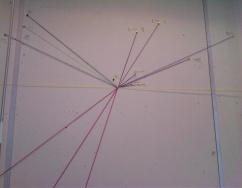
This is an image of the original work created by the other group. We believed the amount of lines used represented the amount of hours the appliance was used for; we also believe this represents the consumption used within a bedroom, considering the types of devices that were shown. We created an image of a phone to add our own information to; we did this using the same method as the original group. Towards the end we found out that both our assumption were correct.
This was the only design out of all other groups that presented their work differently. They used the available material to create the image of the actual appliances used within the bedroom – i found this quite interesting.
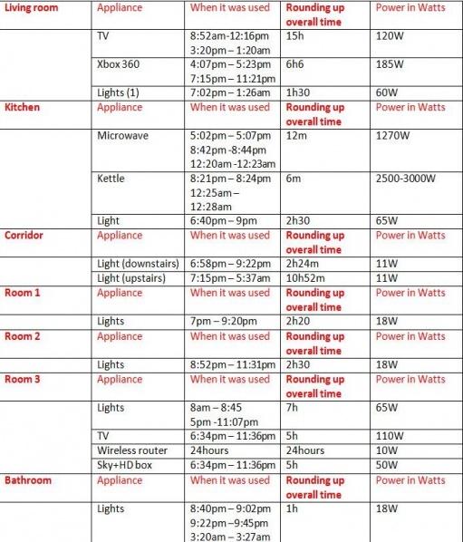
We were all asked to record the amount of electricity consumed within our homes, over a 24hour period, as well as the time the object was used, and the amount of time it was used for (within each room). In addition to this, I recorded the watt for each device used. The table to the side shows my records of each appliance used within the household over 24hours.


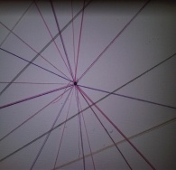
We were all asked to bring in our gathered data to participate in a class project. We were put into groups of around 6/7, with each group given a specific room in a household to represent - our group chose the living room. The task was to create a data visualization using coloured string and pins, to show the amount of electricity being consumed over within the chosen room.
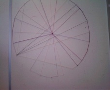
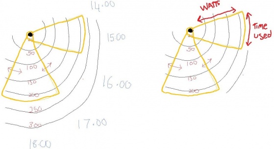
In order to achieve this we had to work with together to discuss ideas on how to present the data, the layout, the size etc. After many sketches later, we decided to have our data represented within the shape of a circle, as a way to represent time – like a 12 hour clock but instead represents a 24hour clock (to show one whole day).
Now we had the layout ready, the next step was to show the amount of time each device was being used for throughout the day. To do this we started to annotate the ‘24hour’ clock with each hour of the day starting from 12 – this would make it easier for us to visualise and pin the approximate time each device was used at.
We said we would have a pin in the middle to help map out our data – the way to use this would be to attach the string to the pin, and to map out the approximate time the device was turned on and off at – then link it back to the pin. This would eventually result in creating a triangular shape.
So now we had both the layout and the time slots; all we needed was to find a way to incorporate the energy consumption. We first went around seeing whose appliance used the highest and lowest watts – in order for us to include a minimum and maximum. We came up with an idea to draw circles within a circle; with each representing average watts used -the smaller the circle the less watt consumption used and vice versa. Eventually we would start of low and increase the watts by 50 each time– for example 50w, 100w, 150w etc. Diagrams and Images of our data are as seen below.


WORKS OF OTHERS:

This map not only allows you to see the amount of bikes being used in London; you can view other counties that this site supports – some being cities in France, Spain, Italy, USA, China, and many more. You can also see latest whether updates for each city/country.
The red dots represent docks being full, whereas the blue represent them being empty. The size of the circles also play a part – the bigger the circle = the more usage over the past 24hours, and vice versa. Towards the bottom right hand corner of the screen is the ‘total’ data that is being recorded over 24hours – you can see a visual graph for this that shows you the total system size, docking stations and amount of bikes in docs. If you don’t want an overall gathering of the data, you can click on an individual circle – this will give you a separate viewing for data received within a specific area.
Other than live data, there is an option to view an animation. This shows you how the map changes throughout the day; you can stop, reset, jump 4hours ahead, slow down or fasten the animation at anytime.

More examples on visual data
Bike Share Map - Oliver O’Brien:
clicking on 'show graph at the bottom right hand side of tha page will allow you to see a graph, visualising the total data so far within the past 24 hours. To simply minimize again press hide graph.
By clicking on a circle, you can see different docks and their information over the oast 24hours.
You can choose a different city to view - i find this interesting as you can compare countries in many ways - for example you can see which city uses more bikes that the other.
Also you can change the colours of the dots under the colour menu.
Zainab Itani
You can also see similar map on the TFL website under ‘Barclays cycle hire’ – this gives details as to when the next available bike is as well has how many bikes left and how much space left in the dock. Click on the link below to view this page.
https://web.barclayscyclehire.tfl.gov.uk/maps
A few other interesting websites I found that portray visualised data are as followed. I recommend you have a quick browse – you may find something you like. It just comes to show that data doesn’t mean boring, it can mean beautiful.
- “This open-source application maps the information that your iPhone is recording about your movements. It doesn't record anything itself, it only displays files that are already hidden on your computer”.
-
-
-
-
-
http://petewarden.github.com/iPhoneTracker/
http://www.techcitymap.com/index.html#/
http://data.worldbank.org/
http://www.visualcomplexity.com/vc/
http://www.noupe.com/inspiration/stunning-infographics-and-data-visualization.html